Styling Web Inbox
Contents
How To
Both the web Inbox and badge widgets are added to your page through Shadow DOMs. This ensures there can be no conflict of styles/fonts etc with your main page. Styling is done via CSS variables, which you should set on your webpage.
For example:
<style>
    :root
    {
        --optimove_inbox_z_index: 9000;
        --optimove_inbox_z_index_1: 2147483645;
        --optimove_inbox_header_background_color: #F10A69;
        --optimove_inbox_badge_right: 15px;
        --optimove_inbox_badge_bottom: 15px;
        --optimove_inbox_badge_width: 58px;
        --optimove_inbox_badge_height: 58px;
        --optimove_inbox_badge_background_color: #F10A69;
        --optimove_inbox_badge_border_radius: 50%;
        --optimove_inbox_badge_transform: scale(0.5);
        --optimove_inbox_badge_transform_origin: center;
    }
</style>
The sections below describe each variable and its effects.
Inbox Component Variables
The following variables affect the appearance and layout of the main inbox component.
Font Family
Name: --optimove_inbox_font_family
ExampleBrush Script MT, cursive
The main font to use for inbox (affects all fonts in inbox).
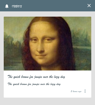
Changing font family to cursive.
If using a custom font, make sure you import it in the head tag of your page. For example:
<head>
    <!-- Custom font -->
    <link href="https://fonts.googleapis.com/css2?family=UnifrakturMaguntia&display=swap" rel="stylesheet">

    <style>
        :root
        {
            --optimove_inbox_font_family: 'UnifrakturMaguntia', sans-serif;
        }
    </style>
</head>
Z Index
Names:
--optimove_inbox_z_index--optimove_inbox_z_index_1--optimove_inbox_z_index_2--optimove_inbox_z_index_3--optimove_inbox_z_index_4
Example: 9000
This variable determines the z index of the inbox. Because the inbox component includes aspects such as popup action menus, there are 5 values.
All layers are optional. Missing values are automatically filled in (defaulting to +1 of previous layer).
Do not set z_index to its maximum (2147483647) otherwise there will be no higher values for layers 1-4.
Background Color
Name: --optimove_inbox_background_color
Exampleorange
Changes the background color of the inbox.
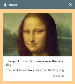
Changing background color to orange.
Width
Name: --optimove_inbox_width
Example: 40%
The width of the main inbox component when not in mobile (fullscreen) mode. Mobile mode kicks in when the width of the screen is below a given threshold.
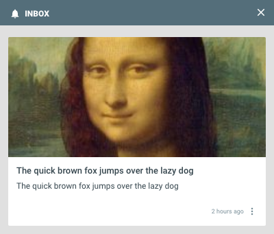
Wider messages by setting inbox to 40% width.
Height
Name: --optimove_inbox_height
Example: 400px
The height of the main inbox component when not in mobile (fullscreen) mode. Mobile mode kicks in when the width of the screen is below a given threshold.
Note: percent values will take into account any top or bottom margin set on the inbox. To set the height to a percentage of the whole screen while also setting margins, use vh (viewport height) instead of %.
Top Margin
Name: --optimove_inbox_margin_top
Example: 20px
The gap between the inbox component and the top edge of the page.
Bottom Margin
Name: --optimove_inbox_margin_bottom
Example: 20px
The gap between the inbox component and the bottom edge of the page.
Horizontal Margin
Name: --optimove_inbox_margin_horizontal
Example: 40px
The gap between the inbox component and the side edge of the page.
Depending on whether the inbox is configured to show on the left or right side of the page, the margin will move the inbox away from the corresponding edge.
Vertical Alignment
Name: --optimove_inbox_vertical_align
Example: center
Possible values:
startcenterend
Controls the vertical positioning of the inbox component when the height is less than 100%.
Use start to align to the top of the page, center to align to the middle of the page, or end to align to the bottom of the page.
By default, the inbox is aligned to the top of the page.
Padding
Name: --optimove_inbox_padding
Example: 0px
The padding to use for the content area of the inbox
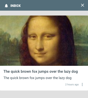
Removing padding from the message content area by setting padding to 0px.
Padding Top
Name: --optimove_inbox_padding_top
Example: 24px
You can optionally set a different padding for the top of the inbox (between the header and the messages).
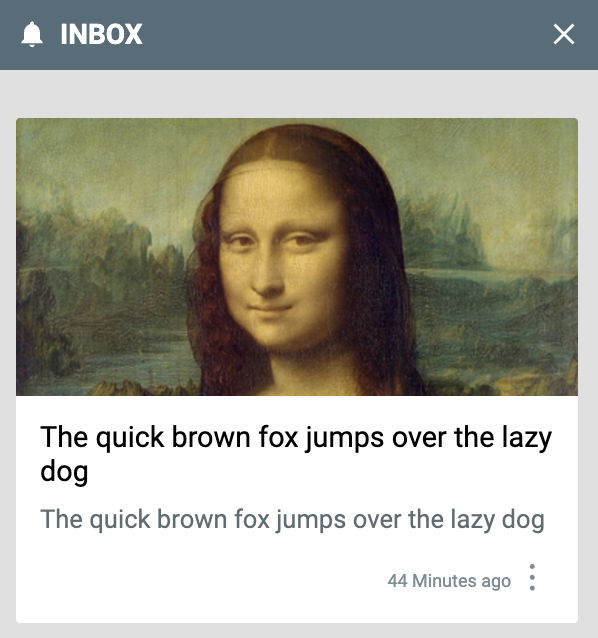
The padding between the header and the first message is increased.
Header Background Color
Name: --optimove_inbox_header_background_color
Example: red
Changes the background color on the header of the inbox (where it says INBOX).
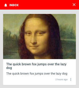
Changing header to red.
Header Font Weight
Name: --optimove_inbox_header_font_weight
Example: bolder
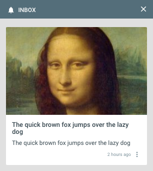
Making header font weight 'normal'.
Header Text Font Size
Name: --optimove_inbox_header_text_font_size
Example: 32px
Change the font size of the INBOX text in the header.
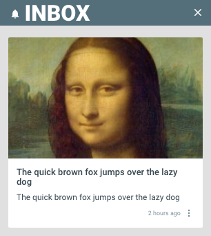
Making header font size very large (32px).
Header Text Color
Name: --optimove_inbox_header_text_color
Example: #AAFF00
Color for the Inbox header line.

Setting header text to green.
Header Bell Icon Background Color
Name: --optimove_inbox_header_bell_background
Example: orange
The background color of the bell icon in the header of the inbox.
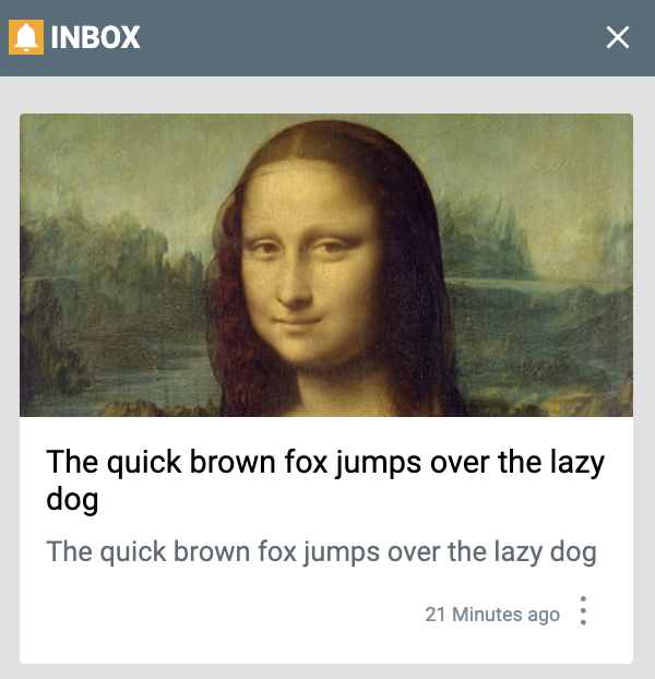
The background of the bell icon is set to orange.
Header Bell Icon Fill Color
Name: --optimove_inbox_header_bell_fill
Example: orange
The foreground fill color of the bell icon in the header of the inbox.

Inbox with the bell in the header set to orange.
Header Close Button Background Color
Name: --optimove_inbox_header_close_button_background
Example: #BB0000
A background can be added to the close button e.g. red.
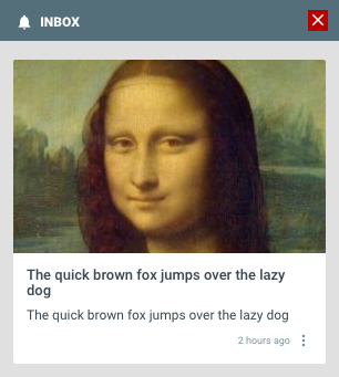
Adding a red background to the close button.
Header Close Button Fill Color
Name: --optimove_inbox_header_close_button_fill
Example: orange
Sets the fill color of the close button.

Inbox with the close button in the header set to orange.
Message Bottom Margin
Name: --optimove_inbox_message_bottom_margin
Example: 0px
Defines how much space exists between each message
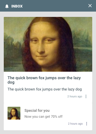
Removing the grey line separating messages by setting the message bottom margin to 0px.
Message Content Font Size
Name: --optimove_inbox_message_content_font_size
Example: 10px
The size of the main content of each message.

The font size has been changed to very small for the message content.
Message Title Font Size
Name: --optimove_inbox_message_title_font_size
Example: 10px
The size of the title of messages.
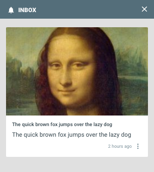
Title is very small (10px).
Message Background Read
Name: --optimove_inbox_message_background_read
Example: #EEEEEE
The background color to use for messages that have been read by the user (previously opened and viewed).
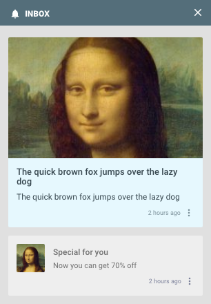
Example setting read messages color to gray (#EEEEEE). The blue color shows for the top message because it is unread.
Message Background Unread
Name: --optimove_inbox_message_background_unread
Example: #FBFFA1
The background color to use for messages that have NOT been read by the user (or explicitly marked unread).
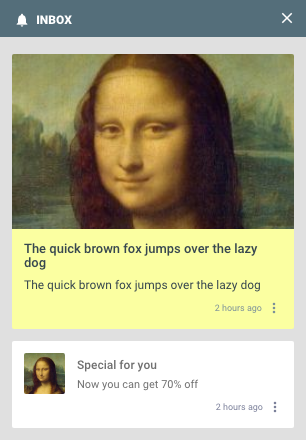
Example setting unread (new) messages to yellow. The other message which is old remains the default (white) color
Message Border Radius
Name: --optimove_inbox_message_border_radius
Example: 20px
Creates a rounded border on messages.
This setting does not affect the top border of large image cards. However this can be included by also setting
--optimove_inbox_message_images_border_radius.
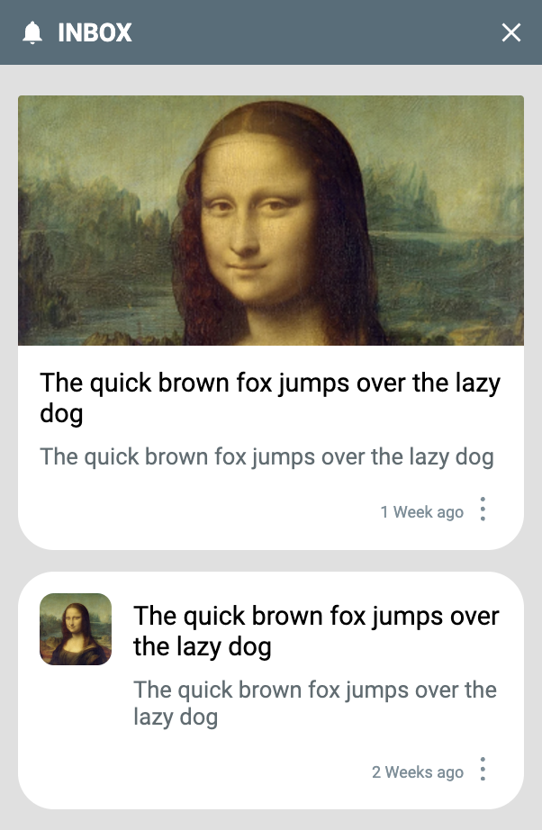
Messages with a wide rounded border (15px). Note that the large image top border is not affected.
Message Images Border Radius
Name: --optimove_inbox_message_images_border_radius
Example: 50%
Controls the upper left and right borders of large image messages (lower left/right are fixed at 0). This can be combined with --optimove_inbox_message_border_radius.
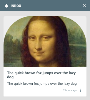
Creating a rainbow-shaped message with image border radius (only affects large image format).
Message Images Small Width/Height
Name:
--optimove_inbox_message_images_small_width--optimove_inbox_message_images_small_height
Example: 50%
Determines the size of the image in 'small' image messages. Typically these should be kept the same as one another to avoid clipping square images.
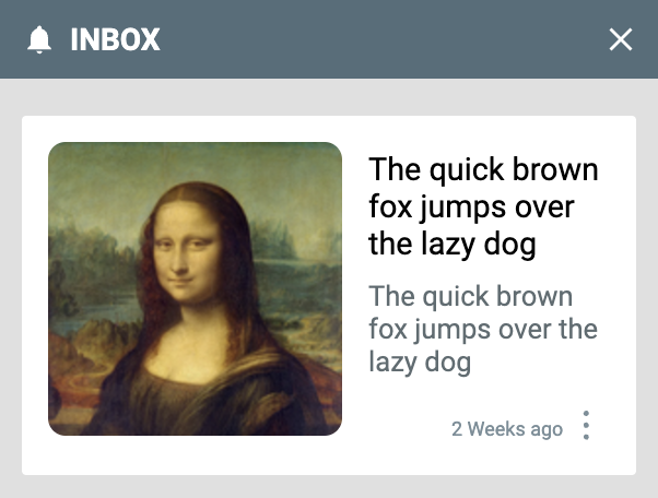
The small image takes up 50% of the message width and height (both are set to 50%).
Message Images Small Border Radius
Name: --optimove_inbox_message_images_small_border_radius
Example: 50%
Controls how rounded the images are on the small message image.
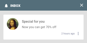
Small image has a completely circular image (50% border radius)
Default Media Icon Fill Color
Name: --optimove_inbox_message_default_media_color
Example: orange
When a message has no media, and you have not configured a default media image, a bell icon is shown. This variable controls the color of the bell.
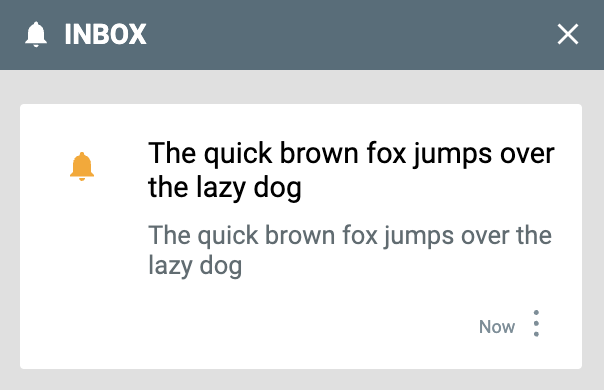
The default bell icon is changed to orange.
Message Title Font Weight
Name: --optimove_inbox_message_title_font_weight
Example: bold
The font weight for the title of messages.

Bolder message title.
Message Title Font Color
Name: --optimove_inbox_message_title_font_color
Example: orange
The color of the title of messages.
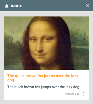
Changing color of the title to orange.
Message Title Bottom Padding
Name: --optimove_inbox_message_title_padding_bottom
Example: 20px
The padding between the title and content of a message.
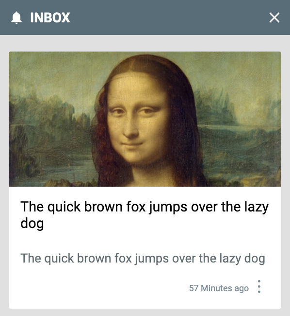
Increased padding below the message title.
Message Font Weight
Name: --optimove_inbox_message_font_weight
Example: lighter
The font weight of the main body of the message.

Content of the message with 'lighter' font weight.
Message Font Color
Name: --optimove_inbox_message_font_color
Example: orange
The color of the main body of the message.

Message with orange font color.
Action Menu Variables
These variables style the context menu that appears when clicking the "3-dots" button on the message.
Message Action Button Color
Name: --optimove_inbox_message_action_button_color
Example: #00aaff
The color of the "x minutes ago" text and the 3-dots menu button.
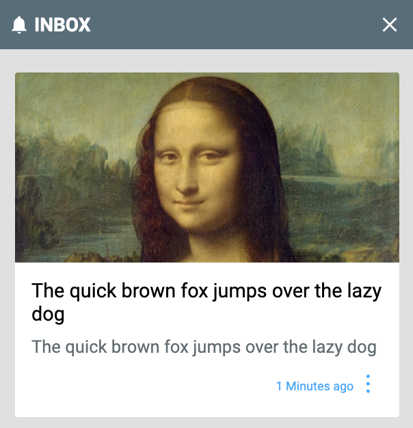
The "3-dots" menu and "1 Minutes ago" text is changed to blue.
Message Action Button Background Color
Name: --optimove_inbox_message_action_button_background_color
Example: gold
The background color of the 3-dots action menu button.
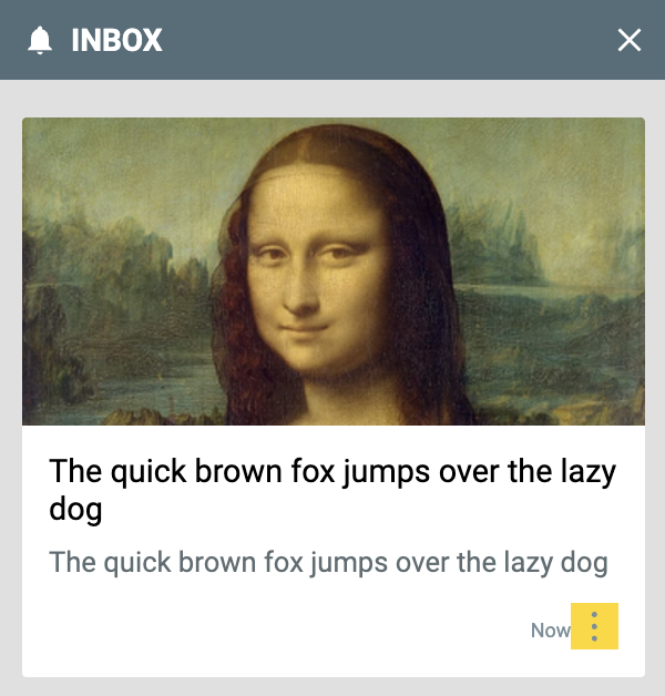
The background of the 3-dots menu is changed to gold.
Message Action Button Border
Name: --optimove_inbox_message_action_button_border
Example: 1px solid black
The border around the 3-dots action menu button.
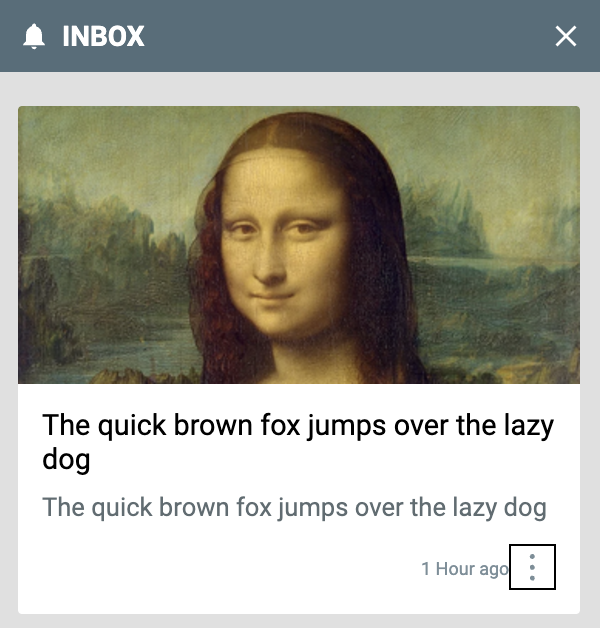
Black border around the 3-dots action menu button.
Action Menu Font Family
Name: --optimove_inbox_action_menu_font_family
Example: Brush Script MT
You can set the font family in the action menu separately from the default font.
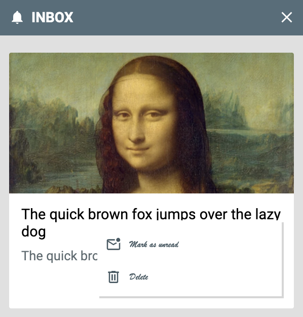
The action menu buttons have a cursive font.
Action Menu Font Size
Name: --optimove_inbox_action_menu_font_size
Example: 16px
Sets the font size of the action menu buttons.
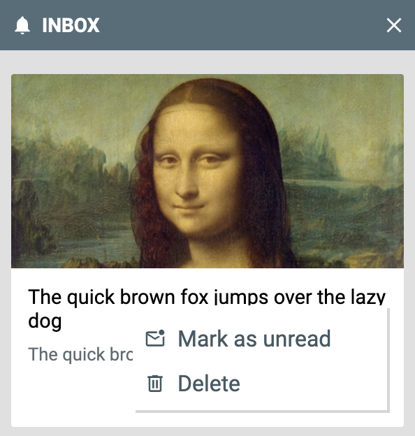
Increased font size in the action menu.
Message Action Button Icon Size
Name: --optimove_inbox_action_menu_icon_size
Example: 24px
The size of the icons in the action menu of each message.

The icons of the action menu items are larger.
Message Action Button Icon Padding
Name: --optimove_inbox_action_menu_icon_padding
Example: 16px
The padding around the icons in the action menu of each message.
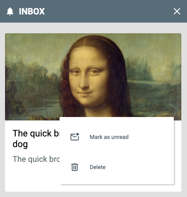
Increased padding around the icons in the action menu.
Message Action Button Text Font Family
Name: --optimove_inbox_message_action_button_text_font_family
Example: Brush Script MT
The font family used by the "x minutes ago" text.

The "8 Minutes ago" text is changed to cursive.
Message Action Button Text Font Size
Name: --optimove_inbox_message_action_button_text_font_size
Example: 16px
The font size of the "x minutes ago" text.
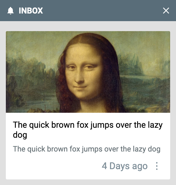
The "7 Minutes ago" text is changed to be larger.
Action Menu Background Color
Name: --optimove_inbox_action_menu_background_color
Example: #91daff
The background colour of the action menu when the "3 dots" menu is clicked.
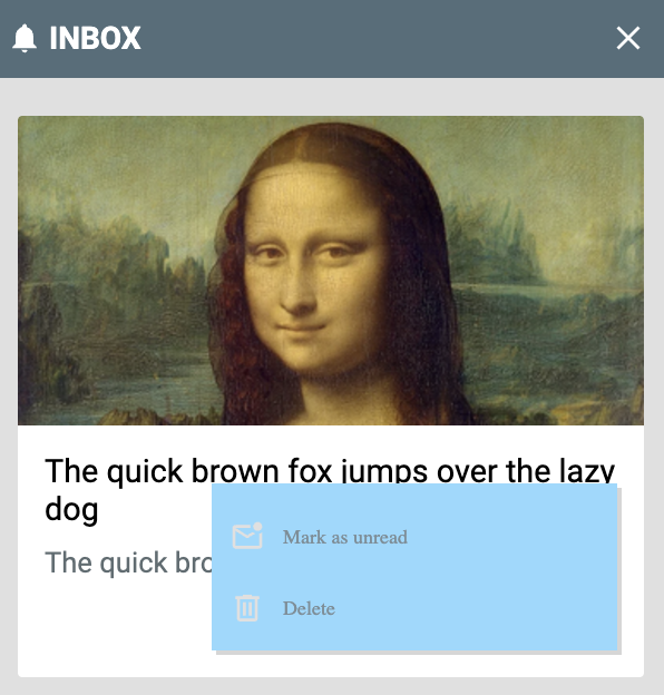
The background of the action menu is changed to blue.
Action Menu Icon and Text Color
Name: --optimove_inbox_action_menu_color
Example: #00aaff
The color of the text and icons in the action menu.
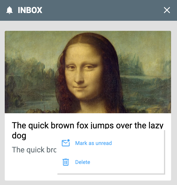
The text and icons in the action menu are changed to blue.
Action Menu Hover Color
Name: --optimove_inbox_action_menu_hover_color
Example: #00aaff
The text color of buttons in the action menu when hovered.

The action menu items are made blue when hovered.
Action Menu Hover Scale
Name: --optimove_inbox_action_menu_hover_scale
Example: scale(1.2)
The scaling factor of buttons in the action menu when hovered. Ensure you set the variable as scale(...), not just the scale factor as a number.

The action menu items are set to scale 1.2x when hovered.
Action Menu Hover Transition Duration
Name: --optimove_inbox_action_menu_hover_transition
Example: 500ms
The duration of the transition when hovering over action menu items.
Action Menu Hover Opacity
Name: --optimove_inbox_action_menu_hover_opacity
Example: 50%
The opacity of buttons in the action menu when hovered.
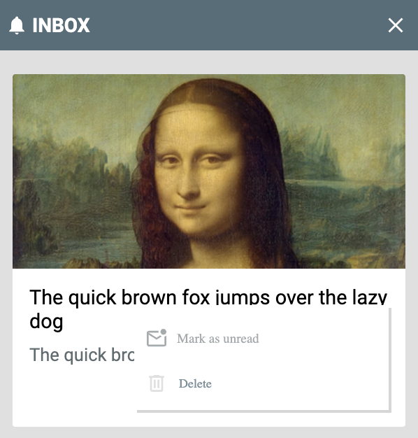
The opacity of the action menu items is reduced to 50%.
Badge Variables
These variables control the positioning and appearance of the launcher badge that shows when enabled in your Web Inbox settings. To use a custom badge image, set it in your Web Inbox settings.
Badge Position
Name: --optimove_inbox_badge_position
Example: fixed
Indicates the position of the launcher badge for Web Inbox when it is enabled. This is passed to the position property of the badge.
Badge Left
Name: --optimove_inbox_badge_left
Example: 16px
This is passed to the left property of the badge. Set to auto to ignore.
Badge Top
Name: --optimove_inbox_badge_top
Example: 16px
This is passed to the top property of the badge. Set to auto to ignore.
Badge Right
Name: --optimove_inbox_badge_right
Example: 16px
This is passed to the right property of the badge. Set to auto to ignore.
Badge Bottom
Name: --optimove_inbox_badge_bottom
Example: 16px
This is passed to the bottom property of the badge. Set to auto to ignore.
Badge Width
Name: --optimove_inbox_badge_width
Example: 50px
The width of the launcher badge.
Badge Height
Name: --optimove_inbox_badge_height
Example: 50px
The height of the launcher badge.
Badge Background Color
Name: --optimove_inbox_badge_background_color
Example: #00aaff
The background colour of the launcher badge.
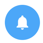
The badge with a blue background.
Badge Bell Color
Name: --optimove_inbox_badge_bell_color
Example: gold
The color of the badge bell icon, if you have not set a custom badge image.

The badge with a golden bell.
Badge Border Radius
Name: --optimove_inbox_badge_border_radius
Example: 8px
The border radius of the launcher badge.
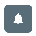
The badge with 8px rounded corners.
Badge Border
Name: --optimove_inbox_badge_border
Example: 2px solid black
This is passed to the border property of the launcher badge.

The badge with a solid black border.
Badge Transform
Name: --optimove_inbox_badge_transform
Example: scale(1.5)
Applies a custom transform to the badge image. This only takes effect when you have set a custom badge image in your inbox settings. Accepts any valid CSS transforms.
Badge Transform Origin
Name: --optimove_inbox_badge_transform_origin
Example: center
Sets the transform-origin property of the badge image.
Badge Alert Settings
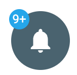
Default Badge
Alert Positional Spacing
Name: --optimove_inbox_badge_alert_left_space_from_edge
Example: 2px
Applies a custom spacing to the edge of the badge (default 8px)
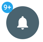
2px
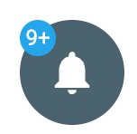
10px
Alert Width
Name: --optimove_inbox_badge_alert_width
Example: 20px
Sets the width of the alert (Default 20px)
Alert Height
Name: --optimove_inbox_badge_alert_height
Example: 20px
Sets the height of the alert (Default 20px)
Alert Background Color
Name: --optimove_inbox_badge_alert_background_color
Example: #ff8560
The background color of the badge alert.
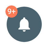
Background Colour Changed
Alert Font Color
Name: --optimove_inbox_badge_alert_font_color
Example: #aaffaa
The background color of the badge alert font.

Font color has been changed to a light green
Alert Font Size
Name: --optimove_inbox_badge_alert_font_size
Example: 0.8rem
Changes the size of the font in the alert. (Will also need to change the width and height of the alert to fit)
Alert Border Radius
Name: --optimove_inbox_badge_alert_border_radius
Example: 10%
Sets the boarder radius of the alert

Alert Border
Name: --optimove_inbox_badge_alert_border
Example: 2px solid red
Sets the border style of the alert
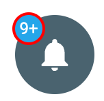
Red border with a thickness of 2 px
Updated 5 months ago